How to Match Jewelry to the Colors You Wear — Not Just Your Skin Tone
October 25, 2026 · 6 min read
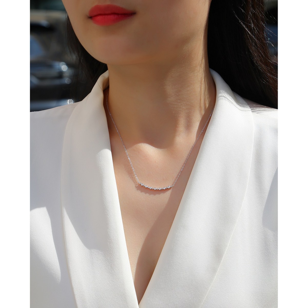
Here's a quiet mistake almost everyone makes with jewelry, and it explains why a piece can look gorgeous in the jewelry box and subtly wrong the moment you put it on with a certain outfit. You matched your jewelry to your skin. But jewelry doesn't sit against bare skin most of the time — a necklace lies against your shirt, earrings frame your hair and collar, a ring rests on your hand next to your sleeve. The surface your eye actually compares it against is fabric, not flesh.
So here's the counter-intuitive truth: the metal that flatters your skin tone can still fight your clothes. You can have nailed the warm-versus-cool chart — we covered that whole system in matching jewelry to your skin tone — and still end up with a necklace that looks "off" because the color behind it is doing something your metal disagrees with. Fixing this doesn't require throwing anything away. It requires matching to the right variable.
Why skin tone is only half the answer
The skin-tone advice is real, but it's incomplete, and it's worth understanding exactly why before you start second-guessing your whole jewelry box.
Color matching works on a warm-versus-cool axis. Warm colors lean toward yellow, gold, and orange; cool colors lean toward blue, grey, and silver. Your skin has an undertone on that axis, and certain metals flatter it better. Fine. But your clothing sits on that exact same axis, and here's the part people skip: a cool metal against a warm shirt creates a visible temperature contrast, and that contrast is what your eye reads as "something's slightly off."
It's not that silver can't touch warm colors. It's that the combination has a temperature tension, and whether that tension reads as deliberate or accidental depends on whether you did it on purpose. A cool silver necklace against a warm camel sweater is either a considered high-contrast look or a mismatch — and the difference is almost never the metal. It's everything else around it.
The honest truth about silver (and why it's easier than you think)
Let me be straight about what this store sells, because it changes the advice. This is a 925 sterling silver house — cool white metal — set with moissanite, which is clear and near-colorless. That's relevant because a lot of generic "match your metal" advice assumes you're choosing between gold and silver. If you're already committed to silver, the question isn't "which metal" — it's "how does cool white metal behave against the colors I actually wear."
And the honest answer is: silver with clear stones is a cool neutral, not a true neutral. It leans cool. That means:
- Against cool and neutral colors, it's effortless. Black, white, grey, charcoal, navy, denim, cool blues, cool pinks, lavender, emerald, most jewel tones — silver disappears into these and just looks right. No thinking required.
- Against warm colors, it needs a beat of attention. Beige, cream, camel, rust, terracotta, mustard, olive, warm reds and oranges, browns — these all lean warm, and a bare silver piece against them can read as a slight temperature clash.
That's not a reason to avoid warm clothes. It's a reason to learn the three small bridges that make silver sit comfortably on them. A piece like the White Moon Star necklace — cool white metal, clear stone — is the perfect test case: it glides over cool colors and just needs a tiny nudge to feel at home on warm ones.
How to pair silver with any color (the practical map)
Here's the map, in plain terms, so you can stop overthinking it.
Cool and neutral colors — wear anything, it just works. Navy, grey, black, white, denim, charcoal, emerald, royal blue, cool pink, lilac. These are the colors where a bright moissanite stud or a clean solitaire ring does its job with zero effort. If your wardrobe is mostly this, you've essentially already won.
Warm colors — use one of three bridges. When you're wearing rust, olive, camel, or mustard, give the silver something to lean on. First bridge: layer against white or cream — a white shirt or a light scarf under a silver necklace cools the backdrop and removes the clash entirely. Second bridge: go minimal — a single delicate piece reads as a deliberate accent rather than a temperature argument; the less metal, the less there is to clash. Third bridge: lean into the contrast — silver against a deep warm red or terracotta is a sharp, high-contrast look that's genuinely stylish when the rest of the outfit is clean. The clash only happens when it looks like an accident.
Deep, saturated colors — let the sparkle do the work. Against a strong color like red, emerald, or navy, a clear moissanite piece catches the light and reads as a bright, neutral pop. This is where the stone matters more than the metal. A pavé-style band or a clear stud against a rich color looks finished, not fussy.
Pastels — you're safe either way. Cool pastels (blush pink, baby blue, lilac) love silver by default. Warm pastels (peach, mint, butter yellow) are light enough that the temperature contrast barely registers. If in doubt, pastels are the easiest category to wear silver with.
The shortcut that replaces the whole chart
If you only remember one thing, make it this: match the metal once, then let the stone be your color.
Silver is your metal — you've already committed, and that's a good, coherent choice, the same logic behind building a capsule wardrobe where every piece works with every other piece. Clear moissanite is effectively colorless, so it goes with everything automatically. That leaves exactly one decision when you get dressed: how much sparkle the outfit calls for, not which color.
A quiet day calls for a single delicate piece. A saturated color calls for one bright piece to pop against it. A warm, tonal outfit calls for the white-cream buffer trick. That's the entire system, and it fits on an index card. You don't need to memorize color wheels or undertone charts. You need to notice the one thing that's actually sitting behind your jewelry — the shirt — and give it the same thirty seconds of thought you already give your skin.
If you want to take it a step further, the length and placement of the piece matters almost as much as its color — which is why choosing the right necklace length and layering and stacking are the natural next reads. But the core fix is simpler than either: stop matching your jewelry to your skin in isolation, and start matching it to the outfit it's actually going to live on.
Keep reading
More from the Journal